Goffman's (1972) 'codes and conventions' theory describes the typical portrayal of women and men in advertisements.
Superiority, Domination and Body Language
Suit Supply (2010)
Men are presented as dominant and superior through their position within the frame and body language, conveying both power and intelligence. The focus tends to be on their facial expressions. Women tend to be presented as sexually submissive and weak, enhancing their physical appearance to create sex appeal. The focus here is on the woman's body parts.
Dismemberment
Tom Ford fragrance (2007)
Females are generally subjected to dismemberment, whereby individual parts of the body (e.g the legs, breasts or lips) are shown rather than the full profile, thus emphasizing the perverse disposition of women as sexual objects. As seen above, these images often have absolutely no relevance to the product.
The Voice-Over Authority
Male authority is also presented in advertisements, as the majority of voice over's are given by male speakers due to the stereotypically deep, powerful pitch of the male voice.
Advertising and marketing example
A brilliant example of this is found in American Apparel's ad below, a company which relies on the regular sexualisation of women as a recurring motif, in order to create a controversial appeal for their products. These can be constructed as demeaning when Goffman's theory is applied.
Meet Trudy (2012)
On the left, "Trudy" is the central focus of the frame, shown in a sexually reclined/ seductive position thus emphasizing her sexuality. The expression on her face is childlike yet inviting, exploiting her vulnerability and assuming submission or subordination to a sexual counterpart. The ad on the right explicitly demonstrates 'dismemberment' where women in risqué poses are divided, with the body parts most archetypal of sexual appeasement displayed as individual close ups.
These voyeuristic ads were in fact banned in the UK. Here is a quote from the Advertising Standards Authority (ASA):
“we considered the images and the model's poses…gratuitous. We considered the images were overtly sexual and that they demeaned women by emphasizing the model's groin, buttocks and breasts and by not including her face”
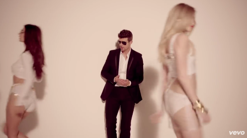
Music video example
Sadly, this can also be found in contemporary music videos. For example, the infamous "Blurred Lines" (2013) video below.
Superiority: Thicke is the focus here, in central position of the frame, looking over his female counterparts.
Domination: T.I holds the woman in his grip, who is thus portrayed as weak and submissive.
Body language: Thicke is shown leaning over and shouting at Ratajkowski, who appears to be vulnerable and complacent towards his actions.
Dismemberment: groin area
Dismemberment: bare legs
The artists of the song are all male and lyrics such as
"just let me liberate you"
"I know you want it"
"I'm just watching and waitin'"
"do it like it hurt"
all seem to perpetuate harmful attitudes towards sex and consent.
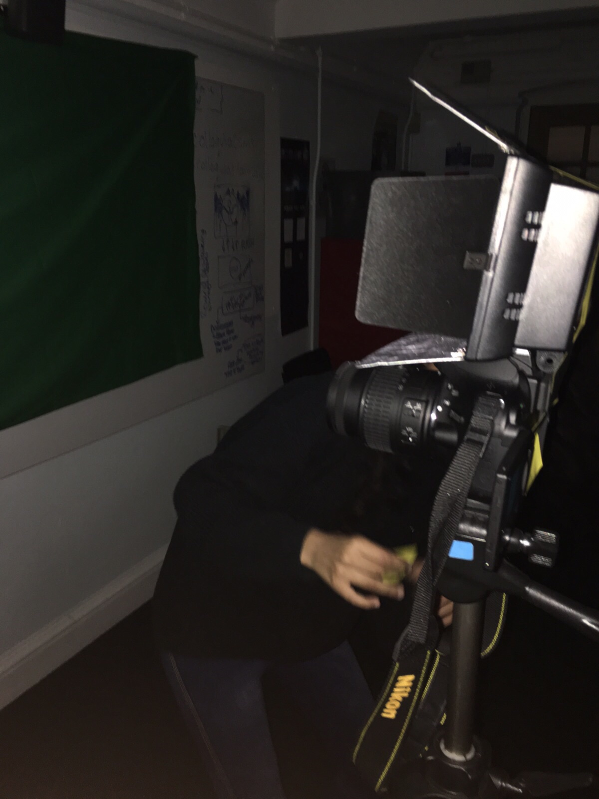
Today we filmed a few more shots in our second location. To create our body projection shots, we used a green/ blue screen, a projector and a hand held LED light. Here is our setup:
We switched off the lights and secured the LED light onto the camera and tripod using some tape:
Here are some of the shots we gathered:
We also tried to shoot using a blue screen to see if the colour keying would be easier:
We realize that this does not project images solely onto Tayla's body, but rather, the whole background. We hope to be able to remove the background of our video or layer the images onto Tayla (in post-production) to create the effect we desire. Here is a quick tutorial we found which may help us to do so:
Alternatively, we may have to use a smaller, hand held projector to have full control of the projection size we require. Here is another tutorial that could help us avoid spending a large sum of money on a projector, while also giving us full control of our where our projected images appear:
Today, our media class attended a music video training session at the BFI (British Film Institute).
Our speaker, Tom Woodcock, explained the history of music videos and took us through a timeline of how they have progressed. The timeline dated back to the 1930's, in which the relationship between music and image was first established for an audience.
Here is the history and theory presentation, shown to us in the first session:
Here are a few of the videos in the presentation that stood out to me:
1935: Len Lye - Colour Box
I found the mixture of colour, light and texture in the video above visually appealing. Achieved using scratch discs and moving random abstract shapes around, the montage created is quite psychedelic and therefore interesting to watch. This is a really useful technique to think about in our own music video, where the layering of images and symbols could help us create texture and depth.
1964: The Beatles - I Should Have Known Better
This video is similar to ours in that it has a narrative focus, with elements of performance. It was in this period, that the industry began to construct artist image through film, explaining the long shot duration(s) in the video above. Being made for A Hard Day's Night (1964) - a comedy exploring youthful charisma - the video works to popularize the artists, by surrounding them with people in a train carriage. This contrasts with our own video, as our narrative sees Little Red Riding Hood face isolation and fear; however, increasing our shot duration might help emphasize the idea of loneliness.
1975: Queen - Bohemian Rhapsody
This classic song/ music video highlights the birth of the pop promo. Despite falling under the pop genre, renowned for videos using vibrant colours and fast-paced editing, Queen employs a dark colour palette to create an eerie atmosphere. Superimposition is also used, where two adjacent shots fade into one another, to create the illusion of a shadow. We would like to create a similar mood in our own video, therefore the video above serves as great inspiration in terms of editing.
1995: Pharcyde - Drop
Directed by Spike Jonze, the video above takes a very creative approach despite having virtually no budget! It required great skill from the artists, who had to learn the lyrics of the song backwards; when played in reverse, their surroundings appear to be going backwards while they themselves moved forward. This was an extremely innovative video for its time, inspiring us on a creative level as we have been challenged to think more closely about how to plan and execute our own video.
Here is the presentation we were shown in the second session:
We were also given 10 steps to ensure success in our own productions:
1. Asses your resources
• start with performers
• gather a technical kit
• establish a location
• detail any props/costume
• work within a time frame
2. Warm up
• practice lip syncing (film and edit)
• do a preliminary task
3. Recce
• limit the number of possible locations
• gather photos and footage
• have access to light and power
• do a risk assessment
4. Pitch
• do a treatment pitch
• create a moodboard
• understand what technical elements are involved
5. "Planning Beats Idea"
• don't get stuck
• plan what's in your head
6. Plan everything
• create a storyboard/animatic,
• prepare everything advance e.g people, places, props, costumes
• plan filming days according to a shooting schedule
• prepare technical elements beforehand e.g batteries, SD cards, grips, lights
• make sure the performer has rehearsed
7. Shoot
• shoot at least 10 times
• get cutaway shots
• shoot from multiple angles and consider lighting changes
• motivate the performer
8. Edit
• synch up footage
• paper edit
• cut and cut again
• upload rough cuts and get feedback
• edit grades and effects in last
9. Evidence
• blog all research
• upload the pitch
• gather photos (stills, BTS shots, screen grabs)
• save all test footage 10. Evaluation
• constantly evaluate details of the production, as we go along
All in all, I think this was a really informative trip as we learned about history of our product and how to be successful in our own coursework production!
In today's lesson, we were introduced to one of our ancillary tasks, the production of a digipak.
A digipak serves as the modern alternative to standard jewel cased packaging. Typically, digipaks are made from 300gsm cardboard, allowing either a matte, gloss or spot varnish finish. Laminating or embossing is also available for digipaks. The four colour (CYMK) model is usually adhered to or a pantone colour scheme is applied, while calligraphy or font type is adapted to suit the style of the album/artist/genre. They have four panels and plastic casing inside, to hold the compact disc. The dimensions (based on a standard 4pp digipak) are 139.5mm x 6mm x 125.5mm.
Digipaks vs jewel cases:
More eco-friendly/ reduced environmental impact as a minimal amount of plastic is used
More compact as they are made out of thin cardboard instead of thick plastic
More manageable and versatile as they are lighter and thinner
Virtually shatterproof and very hardwearing
Increased room for graphic display
Increased value as they look more premium
The generic conventions found on a digipak include:
Album title
Name of the artist/band
Track list and featuring tracks
Album artwork i.e images, photographs or illustrations
Logo or typography
Copyright information
Parental advisory sticker
Record label logo and information
Social media information e.g Twitter, Facebook
Reviews e.g "outstanding", "album of the year" "★★★★★"
Here's a prezi made by Janadhi, one of my peers in media, which brilliantly explains Saussure's 'Signifier vs Signified' theory.
When applied to music videos, visual elements in the mise-en-scene often act as signifiers to create a certain atmosphere or mood, as seen below.
Describing the M3LL155X (or "Mellissa") as her "personal female energy", FKA Twigs created an audio-visual for 4 tracks featuring on her EP, which challenges gender norms and make bold feminist statements throughout. Saussure's theory can be linked to the video, as the audience can make clear connotations (from imagery in the video) about the creative direction of the artist and the message she was trying to convey in each song/video.
"Figure 8"
Signifier = Michele Lamy styled as an Anglerfish
Signified = sexual dimorphism, the act of luring and possibly predation
"I’m Your Doll"
Signifier = deflated sex doll
Signified = female sexual objectification and submissiveness and the damaging effects of sexual and emotional intimacy
"In Time"
Signifier = pregnant belly
Signified = sexual politics and body ownership as a result of the misogynistic treatment she suffers
"Glass & Patron" (1)
Signifier = image of giving birth to coloured paint/cloth
Signified = birth of FKA Twigs' passion, metaphor for the creative process
"Glass & Patron" (2)
Signifier = red dancers outfit
Signified = new found femininity, developing sexual confidence
Here is a really useful presentation I found online, explaining Katz and Blumler's (1974) 'Uses and Gratifications' theory.
Like Staurt Hall's audience reception theory, this approach recognizes that audience members have an active role in interpreting a media text, and that consumers are responsible for choosing media texts to meet their needs e.g
Identity
Education
Escapism
Social interaction
This theory can be applied to our music video, as some audience members may be drawn to our video, particularly for themes of identity and escapism.
Below is a slideshare I put together, which describes the theory of cultural hegemony by Gramsci. This theory can be readily applied to the corporations in the music industry, who are among some of the top influential institutions around the globe.
Researching Gramsci's theory has helped me understand the importance of the production and distribution of our final product(s) in reference to 'hegemonic values'. Our product must represent the issues that the expositions of our current society aim to address, in order to be accepted by the audience. These include the modern stance on 'femininity' and what it means to be a woman in today's society, as well as 'adulthood' and the fears that young women face when they come of age.
Here are some examples of framing and composition in our own shots.
This shot conforms to the Rule of Thirds, as Tayla is positioned on the right-hand side of the shot, making her movement appear more natural and fluid. We used the empty space to show elements of the forest location, such as the 'autumn leaves' and 'trees of loneliness', as to compliment the atmosphere created by the lyrics.
Here, Tayla is the central focus of the shot, drawing the eye directly towards her. The shot is dominated by her figure, making her appear bold and empowering while emphasizing her star image.
We have played around with the eyeline rule and headroom in our shots. In the first two shots, we felt that it was important to conform to the rule to make the shot appear more sophisticated while our star was lip syncing. However, we have also chosen to break the eyeline room and leave little headroom in the close up shots of Tayla in the forest, as it disturbs the balance of the shot, reflecting our characters state of mind.
Good leading space is shown in the shot below. This creates a sense of vulnerability for Little Red Riding Hood, emphasizing the dimensions of the forest and Big Bad Wolf, in comparison to herself.
By encompassing Tayla with brambles and trees, she appears small and insignificant in the frame. However, her red cape allows her to stand out among the naturally filemot coloured elements of the forest. The surroundings therefore work to highlight her presence in the large, scary forest.
Geometric shapes have also been used to help compose our shots, with the natural diagonal and vertical lines created by the trees, drawing focus to 'the morning light' and the protagonist running across the frame. This makes her movements appear more dramatic, as she cuts across the frame horizontally, disturbing the peace created by the smooth and easy to follow vertical lines of the trees.
We have also managed to incorporate The Golden Ratio in our shots, making Little Red Riding Hood's movements appear graceful. This allows the viewer to understand our stars position within the frame according to the narrative, as she is looking out into the empty space, in search of the Big Bad Wolf.
In today's lesson, we learned the importance of framing and composition. This refers to the placement of elements within the restriction of the frame. Good composition requires a balance between the focal point, the foreground/ background and any subjects present, which supplement the mise-en-scene. Arranging colours and shapes which complement each other well can create a much more appealing shot.
Examples from existing indie music videos are shown below each key aspect of framing and composition:
The Rule of Thirds
The rule of thirds describes the alignment of a subject in a 3x3 grid, with the object of interest lying at the intersection points. By observing the rule of thirds, the shot becomes more interesting and artistic. Having the focal point placed off-centre makes the shot appear more natural. Placing the focal point of interest near the edges, creates eye movement and a natural sense of following. This is considered to be more visually stimulating and can therefore create a much more captivating shot.
It also encourages us to make creative decisions on the negative space around the object.
Amber Run - I Found
Central focal point
On the other hand, by placing the focal point of the shot in the centre, the eye is immediately drawn towards it. The central placement of an object is considered static as the equal distance on all sides implies that there is nowhere for the eye to follow. Having large amounts of empty space around the subject creates a balance and allows the subject to dominate the shot.
Florence + The Machine - Dog Days Are Over
Eyeline Rule / Headroom
In close up shots, it is a general rule that the eyes should be positioned 1/3 of the way down the frame and should almost never be allowed to drop below the central line.
It is also key to allow headroom, to give a relaxed feel to the shot. Too much headroom will be too spacious and may draw the viewers attention away from the focal point, while too little headroom can appear cramped and uneasy on the eye.
Shura - Touch
HAIM - Forever
Leading Space
Good leading space is achieved, when an object is on the either the left or right-hand side of the frame. When shooting a person, the leading space should be in the direction that a person is looking, to create a sense of interactivity and fluid movement. This allows the viewers eyes to follow the eyes of the subject across the frame. If the leading space is empty, it can suggest freedom and openness.
Glass Animals - Hazey
Encompassing/ surrounding subject
Encompassing or surrounding a subject with something else, can complement the focal point of interest to ensure it demands attention. Extra subjects, distributed evenly around the figure, can help to balance the composition of a shot and create a sense of authority or formality within the frame.
Seafret - Oceans
Geometric Lines
Vertical and horizontal lines create a sense of peace, with the eyes of the viewer crossing the image in a linear way. The use of such lines allows fluidity and smooth motion, as there are less intersections and therefore minimal distractions.
Lana Del Rey - Burning Desire
Diagonal lines create perspective, as they intersect with other lines in the shot. Various intersects can help add depth to a photo, while also drawing the eyes across the shot, usually towards a focal point. This suggests a sense of action and emphasizes the prominence of the focal point when the eyes finally reach it, make the image feel more dynamic and three dimensional.
OneRepublic - Counting Stars
Other geometric lines can be manipulated, such a S lines which lead the viewers eyes across the frame in a continuous and graceful manner, making the image appear more artistic and elegant.
Tame Impala - Feels Like We Only Go Backwards
The Golden Ratio
The Golden Ratio defines a spiral pattern that shows up repeatedly in Nature, in everything from sea shells to the galaxy itself. It is coined as 'nature's number' because it occurs so frequently, and it can therefore be used to mimic the balance of organic objects. Fibonacci's Spiral creates the illusion of a natural flow, leading the viewer around the frame in an refined arc, which is considered to be visually appealing.
Banks - This Is What It Feels Like
The Weeknd - Belong To The World
We can apply these techniques when filming, using the gridlines on our camera setup or arranging the composition of elements in our frame beforehand, to create more a visually exciting sequence of shots in our music video.
Mac 5 conducted an audience research questionnaire, produced using SurveyMonkey.
This website made it super easy to construct a survey and has various options for quick distribution.
We distributed the questionnaire using various platforms, including Facebook, Twitter, Whatsapp and we also gave people the direct web link. Here are some examples:
Twitter
Facebook
Whatsapp
SurveyMonkey has an 'analyze results' tab, in which we can track the progress of our questionnaire.
So far, we have various participants presenting a range of different social demographic variables.
SurveyMonkey is region specific, so although our questionnaire may only be answered by participants in the UK, we feel that the results can be applied outside of the UK as our target market is only age and gender specific (female, 16-24yrs).
In addition to this, we also asked a bunch of people we know (all of whom fall within our target age range) to answer our questions in front of the camera. This allowed us to capture the immediate thoughts of our audience, which we found to be a really useful method of collecting responses. In doing this, we could see what ideas came off the top of their heads and incidentally, which elements of a video stand out furthest/ are most memorable for our audience...
Here is another presentation I made, which details Stuart Hall's (1974) encoding and decoding theory.
This sees that audience members fall into 3 positions when processing a media text.
The dominant-hegemonic position
The oppositional view
The negotiated position
Audience members are seen as either passive or active in the way they encode/ decode and media product.
This can be closely linked with our music video, as many of the symbols and themes woven through the narrative are presented implicitly. It is the audience members themselves who have to decode the moral of our fairytale themed music video.
Here is a quick presentation I made, which highlights the importance 4C's model, proposed by Young and Rubicam, in audience research and consumerism. This model is based on Maslow's Hierarchy of Needs (1971) and groups consumers into labels that suggest their position in society.
This can be applied to the production of our music video, digipak and poster as it gives us an insight into the core motivations of our target audience to create a greater appeal for our product(s).
In our group, we took an online test to see which of the seven categories we fall into. Here are the results:
The term 'audience' has several meanings, best described in a media studies approach as 'the collective groups and individuals addressed, and partly constructed by media industries'.
Kitzinger (2004) groups audience research into four main areas:
Market driven research: this seeks to brand audiences as consumers, monitoring their 'attention flow' or the number of 'eyeballs' a product is attracting. Modern day corporations are highly proactive in researching what they perceive might be a useful audience response.
Concerns about morality and sex n violence: this focuses on the corrupting power of the media 'all on their own', isolated from social shaping and broader influences. For instance, social media and its often-malign influence on young users, in isolation, is now subject to this approach.
Responses to technological developments: this refers to cinema in the 20's, TV in the 50's (when it was a new medium) right through to children and others groups' use of interactive media today.
Questions about culture, politics and identity: this is concerned with the media's role in framing public understanding and also the ways that we use media texts and objects in relation to identities, pleasures and fantasies.
Audience is a key concept in media studies; all media is produced with an audience in mind. Media institutions only finance products to make profits, with the audience being the source of money. An understanding of the potential audience is key as it helps producers shape an advertise their text or product, in a way that will appeal to a market with known viewing habits most effectively. If this is done well, it is likely that the product will rake in a greater amount of profit.
Audiences themselves also share their experience with a product or text by word of mouth, which somewhat sees the audience as advertisers themselves. More recently, the interactive role of audiences, where they are asked to vote, produce, document and engage with different media texts has increased the value and power of such texts.
Audience research can be done by various means, including the study of social demographic variables or the personal statistics of a particular group in society.
A common and traditional method called 'demographic segmentation' can be applied here. The breaks down a 'mass audience' into different categories, which a media organization will then narrow down and choose from. The refined and chosen group become a 'target audience'. The producers then decide which way to conduct their research...
Primary audience research: direct investigation of the needs, desires and media habits of an audience. This involves contacting and directly approaching members of the target audience individually, as we have done in our audience research questionnaire.
Secondary audience research: this analyzes the data collected from other research that was previously conducted. Modern day technology means that sources like the internet along with consulting books, magazines and journals are easily accessible. The wide range of quantitative (statistical/ numerical facts and figures) and qualitative (written opinions, thoughts, beliefs) research can be used to construct an unbiased critical analysis of the target audience.